Tag Archives: St Brigid Press

WIND INTERVALS book launch update!

ManyCoversWI3

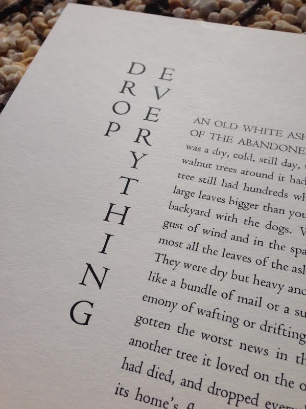
As the publication date of Wind Intervals — and its accompanying book launch on April 28 at Black Swan Books in Staunton, VA — draws near, I took some time this morning to drive over Afton Mountain to visit Emily Hancock at St Brigid Press to get a glimpse of the first bound books. (Of course I took a few copies away with me.)

It may be because I brought Emily a big cup of black coffee which she really did not need, but soon we were engaged in a rambling high speed talk about what it’s like to be the designer and printer of a book of poems in a letterpress environment. I started recording about halfway into our talk and wanted to share it with you in case hearing two people get nerdy about printing presses and book design and handmade paper is your Kind of Thing.

We talk about the making of the amazing hand-made cover paper for the special edition of Wind Intervals (seen in the photo above); how it’s likely that a letterpress printer spends more time typesetting and printing a poem than the poet spends writing the poem; we introduce weird words like “couching” — pronounced “cooching” — to the Poor Listener; we talk (I think!) about the use of actual Japanese maple leafs for illustrative printing inside the book; we talk about the relative stupidity of deciding to go with leaf print illustrations in the dead of winter when there are no leaves to go out and pluck from the trees outside; and Emily talks about the makeup of the two editions of the book and the materials that went into each.

The Japanese maple that loaned us the leaves for the illustrations stands just about twenty feet from the entrance to the Press. It’s in full leaf now, as is much of the mountainous area around us.

If any of that interests you, check out our rambling and entirely unedited conversation below or here.

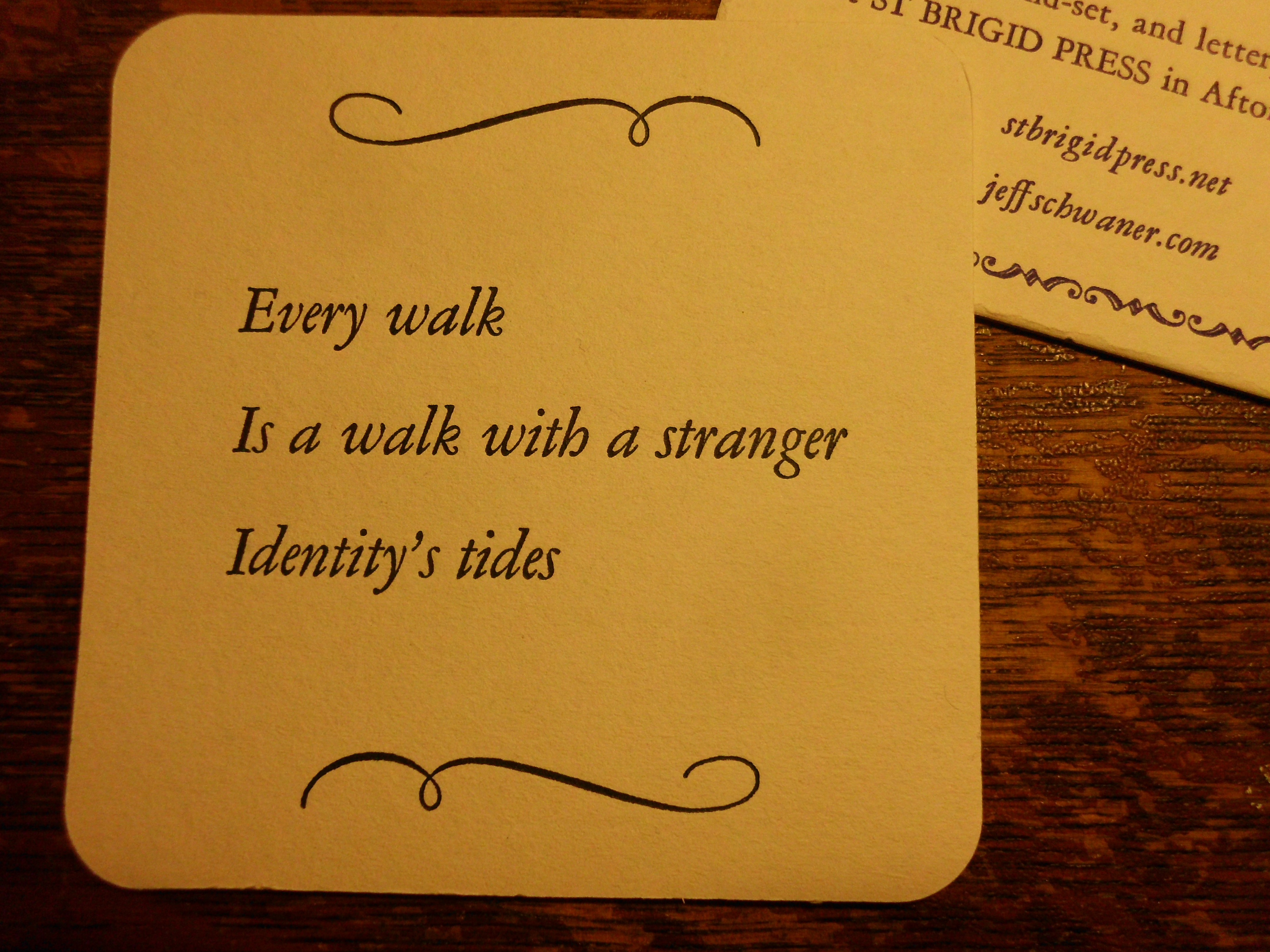
To find out more about Wind Intervals and to pre-order a copy before the April 28th book launch, check out the blog at St Brigid Press.

Publications: Wind Intervals

closeupwindintervals

I’m excited to announce that St Brigid Press will be publishing a beautiful letterpress edition of a selection of my poems, Wind Intervals, in late April — just in time for National Poetry Month.

The book will be hand-set in Bembo type, printed on a beautiful and rugged 1909 Golding Pearl treadle press on the other side of Afton Mountain at St Brigid’s not-entirely-top-secret headquarters, guarded by trees, a gregarious dog and stunning mountain views.

There will be a Standard Edition, hand-bound at the Press and limited to 150 numbered copies ($24), and a Special Edition, limited to 35 numbered and signed copies, printed on Revere Book mouldmade text paper and hand-bound with St Armand handmade covers ($35).

You can hear me read two of the poems from the book here on the St Brigid Press site.

The book’s publication date is April 28, 2017. We’ll gather at Black Swan for a book launch and reading. If you pre-order with St Brigid and cannot make the trek to Staunton, I’ll gladly sign copies at the launch before they are shipped.

closeupthestones

As you can imagine, creating a letterpress book involves considerable work, including setting each letter (and space!) by hand in metal type. On a Golding press, the type is actually suspended type-side down for printing (which somehow seems right for my poetry!) after being locked tightly into place by wooden blocks and metal quoins.

WIfirstpoemontheGolding

goldingfullview

I will keep you updated as work on Wind Intervals proceeds! Check out the St Brigid Press site for more information on the book, additional photos of the book creation process, and to hear two of the poems.

Interview with St Brigid Press

ladybug

“Much of our experience takes place in an interior landscape. But … the most mindful way to access that seems to be through the external landscape.”

Emily Hancock of St Brigid Press interviewed me May 20 at the SBP printshop in Afton, Virginia. You can hear the interview and read the transcript here.

St Brigid Press will be publishing a chapbook of my work, Wind Intervals, in the late summer.

Bridgewater International Poetry Festival: Day One

Well, Day One is in the books and even at half a day it was a whirlwind of readings and meeting lots of fine people dedicated to the craft of writing and the art of poetry.  Festival Mastermind Stan Galloway, a professor of English at Bridgewater, has convened an eclectic group of poets here to this cozy college, and a roving gang of 18 student volunteers has helped support the festivities with tech help, directions, pizza and, of course, coffee.

Once the festival really got going, you are faced with two different reading locations, each hosting two poets an hour. I was paired with Jim Gaines, which was a good match as we were both working on translations as well as on our own work. Some other interesting or odd tidbits from Day One:

  • The first two poets, Stephen Corey and Pamela Uschuk, both read poems which included peonies in them. Strangely enough, one of the poems I read, directly after their reading, also included peonies. Wha?
  • Sirwan Kajjo, a Kurdish poet living in the DC area, read three poems in English and (on request) another in his native tongue (English being his third language!).
  • Matthew Hamilton has had so many lives — soldier, peace corps volunteer, benedictine monk, and librarian — that I had the surreal impression I was meeting someone who had just walked out of a Mark Helprin novel, who happens to be a darn good poet as well.
  • I missed as many good poets as I got a chance to see, but this is the trade-off of a festival like this. it’s invigorating and exhausting at the same time.

Emily Hancock of St Brigid’s Press, along with several other supporting literary establishments including the Georgia Review, whose editor Stephen Corey can be counted among the poets presenting their work, were present and selling their books. Although I forgot to mention this in my own reading today, three of my works are available at the St Brigid table — the broadside of the prose poem Drop Everything, a handsome broadside with moon-shaped matting of my translation of Li Ho’s Sky Dream, and the omnipresent haiku coaster sets.

I survived my own reading early in the afternoon with the help of a supportive audience. Twenty minutes can seem like an eternity or like the snap of a finger when you’re reading your work. If you’d like the silent virtual tour of what I read, you can follow the links below. On to Day Two!

Poem for the Back Cover of a Book

Self Portrait at Forty Nine

Fire Followers

Nobscusset Burial Ground, Dennis MA

On Translating a Poem from the Chinese

Two poems about the moon, one mentioning the moon six times and one not mentioning the moon at all

Mei Yao-ch’en and I Lament Missing the Lunar Eclipse…

Mei Yao-ch’en and I, Walking Downtown for Pizza on a May Afternoon…

…Mei Yao-ch’en and I Await Fourth of July Fireworks…


2014 Broadside Series: “Drop Everything” (first proofs)

Some shots of first proof off the press. (All photos below were taken by Emily Hancock of St Brigid Press, as she was doing first proofs.) This is on the bamboo paper.

DE_title proofAnd here’s a look at the entire shape of the broadside…

DE_first proof on bamboo2We’re still deciding what the best paper might be.  Emily ran some proofs on other stock and we’re going to go over them with our magnifying glasses and every nerve of our fingertips to see which looks and feels the best. The typeface is 18 pt Centaur, so the paper has to take the ink from a decent size letter while holding to the fine points and handling ligatures.

DE_proof on four papersOf course, it’s impossible to tell the fine differences in these examples without holding them and eyeballing them first-hand. What the heck good is this internet thing anyway if you still have to hoof it over a mountain to see your proofs? (Though there’s always offering free coffee to your printer to get her to come over the mountain to you…)

More later this weekend…


2014 Broadside Series: “Drop Everything”

Drop_Everything_typeset2


Work has begun in earnest on a broadside of my prose poem “Drop Everything” over at St Brigid Press in Afton, Virginia. Resident print guru Emily Hancock sent me the photo above after setting the poem and getting it set up on the press for proofing. Tomorrow we should see some first proofs of the work. Some details on the broadside:

The poem is set in Centaur,  a crisp and classic typeface suitable for both prose and poetry. It also has strong flavor notes of caramel, charcoal and cherry, with a smooth finish that pairs it well with both fish and fowl…wait, I’m getting carried away here.

The poem is part of a larger project entitled The Drift, which somewhat aimlessly uses as its model one of the first anthologies of great classical Chinese poetry, Poems of The Masters, originally compiled in the 13th century and consisting of some of the great poems written in the 7th-13th centuries. This project will pair several hundred short poems,  based on regulated verse of the T’ang and Sung dynasties (which I have been posting on this blog since December of last year) with prose poems dealing with the same subject matter in a very different form.

There are quite a few wrinkles to this large project’s design, and more on said wrinkles much later, but all this is to say that when designing the broadside for “Drop Everything” Emily and I took into account the influence of classic Chinese poetry on the overall project– and also the method of transmission of those poems back over a thousand years ago. This includes printing the poem on a high quality bamboo paper stock in a strong vertical format (probably around 12 x 18 inches).

We haven’t yet decided on the number of this edition, or the price. It will most likely be offered as part of a series of broadsides to be released over the coming year. Still working out all those details, but incredibly happy to be working with Emily again (St Brigid Press printed the haiku coaster set available on the Books page) and excited to share with you images of the first proofs as they come off the press later this week…

You can find the poem “Drop Everything” on the Brand New Stuff page above.

More soon…

A few images from Saturday’s work at St Brigid Press

Close up of the back of the coaster. The title is in Copperplate Gothic.

Close up of the back of the coaster. The title is in Copperplate Gothic.

Back on the rack! Behind the newly printed coasters is the lovely Golding press responsible for the handiwork, along with Emily Hancock of St Brigid Press.

Back on the rack! Some of the output of a day’s fruitful collaboration between a Chandler and Price 10×15 NS press (born in Cleveland, in 1914) and designer and printer extraordinaire Emily Hancock of St Brigid Press (born in North Carolina, much more recently).

Tomorrow, more of the same. Monday: The haiku go on the press. The entire haiku sequence can be found in the book Vanishing Tracks, available here as a free PDF or hardcover book.

I’ll have a link up in the next day or so to pre-order this limited edition series of “Night Walk on Cape Cod” printed in letterpress on durable drink coasters.

All photos courtesy of St Brigid Press