Night Walk on Cape Cod, 7 of 8
Leave a reply


If you have never seen a letterpress in action, check out this video, which Emily over at St Brigid Press made while working on the haiku sequence:

Close up of the back of the coaster. The title is in Copperplate Gothic.

Back on the rack! Some of the output of a day’s fruitful collaboration between a Chandler and Price 10×15 NS press (born in Cleveland, in 1914) and designer and printer extraordinaire Emily Hancock of St Brigid Press (born in North Carolina, much more recently).
Tomorrow, more of the same. Monday: The haiku go on the press. The entire haiku sequence can be found in the book Vanishing Tracks, available here as a free PDF or hardcover book.
I’ll have a link up in the next day or so to pre-order this limited edition series of “Night Walk on Cape Cod” printed in letterpress on durable drink coasters.
All photos courtesy of St Brigid Press
Eight haiku. Twenty four total lines. A unique drink coaster printing project. What’s the big deal?
Hundred-year old presses. Tiny pieces of metal type. Questions like, errr, do we have a ligatured ff instead of a regular ff? Did a piece of roman type slip into the italic type drawer? Did we just really run out of lowercase e’s?? And so on.

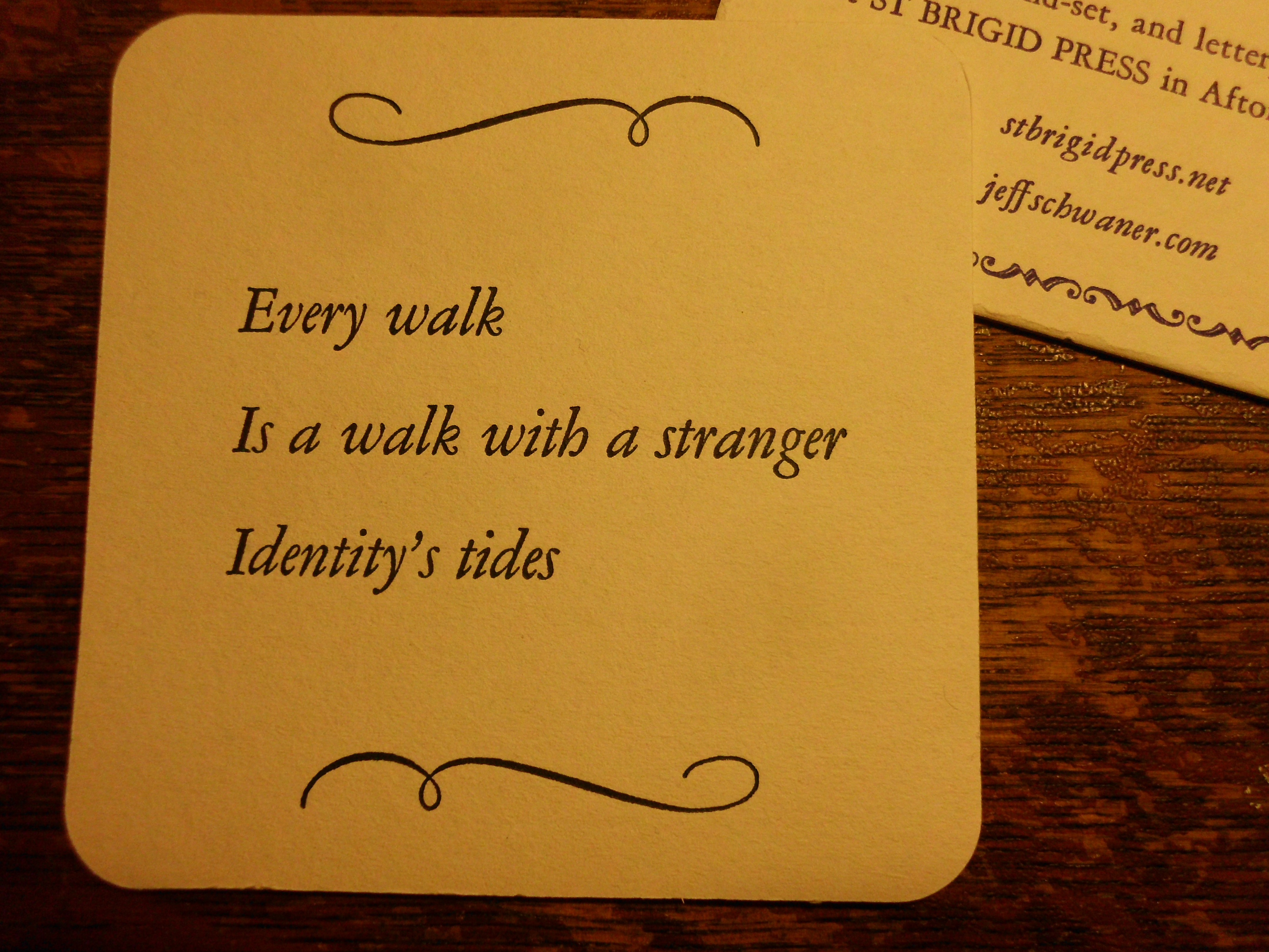
First poem in the haiku sequence. The ink is a rich dark green.
Here’s Emily’s design for the haiku side of the coaster, with a proof on regular paper placed on top of a coaster so you can see the approximate registration.
I like that the haiku has its own space, and that all the other information, including the title and sequence of the poems, is on the back. It gives the reader the experience of the poem alone.
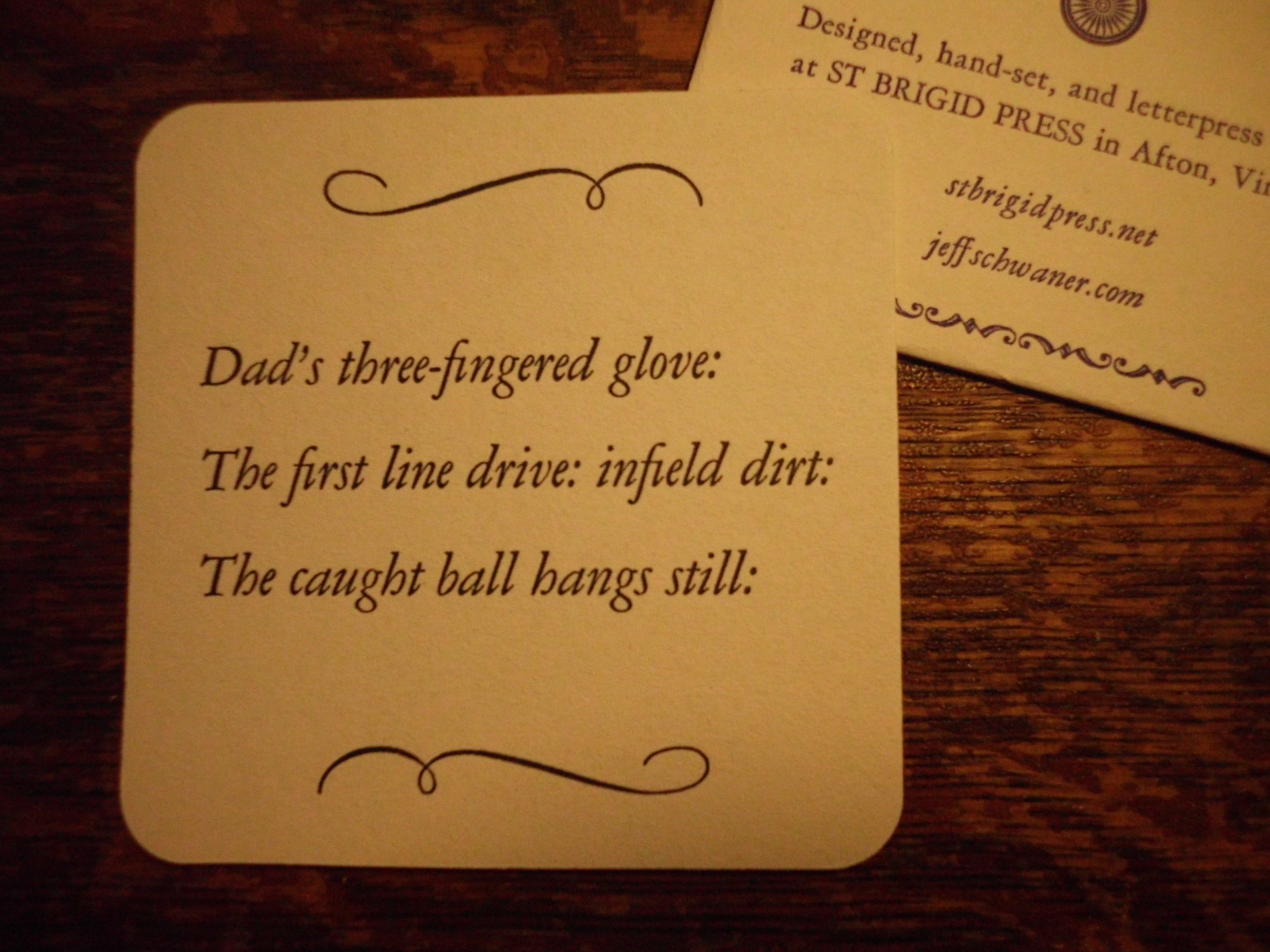
And here’s a proof of the last poem in the sequence:
An old Marvel Comics-inspired No-Prize to anyone who spots the Boy I’m Glad We Proofed This detail. Oh, wait. I’m out of No-Prizes. So just read the copy to the left.
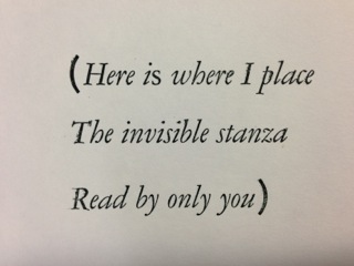
I was so enamored with seeing my own work printed in beautiful Garamond that it took me over a dozen views before I noticed the “s” in the first line is a roman “s” and not an italic “s”. Now there’s a whole philosophical movement going back a couple-three generations among some printers that states you should leave some flaws in your work, because after all to err is human, and in some cases perfectly so. But in this case I decided that I’d just stick with fixing it and not get all philosophical.
That will be the reader’s job, upon the second or third drink…
Photos courtesy of St Brigid Press

This jigsaw of metal type, wood and quoins (those locks that hold it tight)…
I met with Emily Hancock of St Brigid Press today to go over some designs and proofs of the “Night Walk on Cape Cod” haiku sequence. When you set metal type by hand, you cannot be cavalier with your design decisions! After years of using InDesign to design books, it was wild getting back into a workspace where each letter and every bit of “empty” space is actually a physical object to place so that the reader best navigates the printed page. (No Ctrl-Z here, sez he!)
…placed on this hundred-year-old press and adjusted and tweaked by Our Dedicated Printer…
The full set will be 8 coasters, each with a different haiku from the sequence. The front/top will have the haiku with a wave-like ornament, printed in a wonderful dark green. Emily hand-mixed this color using at least two different greens and black.
The back will have the sequence title, the place of the poem within the sequence, and the printer’s mark.
Emily has set type for five of the eight haiku, and printing will begin this weekend.
In letterpress printing, nothing is as simple as it seems. Even in printing the coaster’s back, Emily will have to stop printing eight different times, pull the type off the press, and adjust the sequence number on the back (see below for proof of what the back of the first coaster will look like).

…turns into this proof of the coaster’s back. In the background is an actual coaster, undoubtedly anticipating its eventual transformation.
The typeface for the poems is Garamond Italic, and in the next post I’ll show a few proof samples of the haiku design.
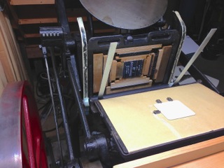
Photo of the press courtesy of St Brigid Press
