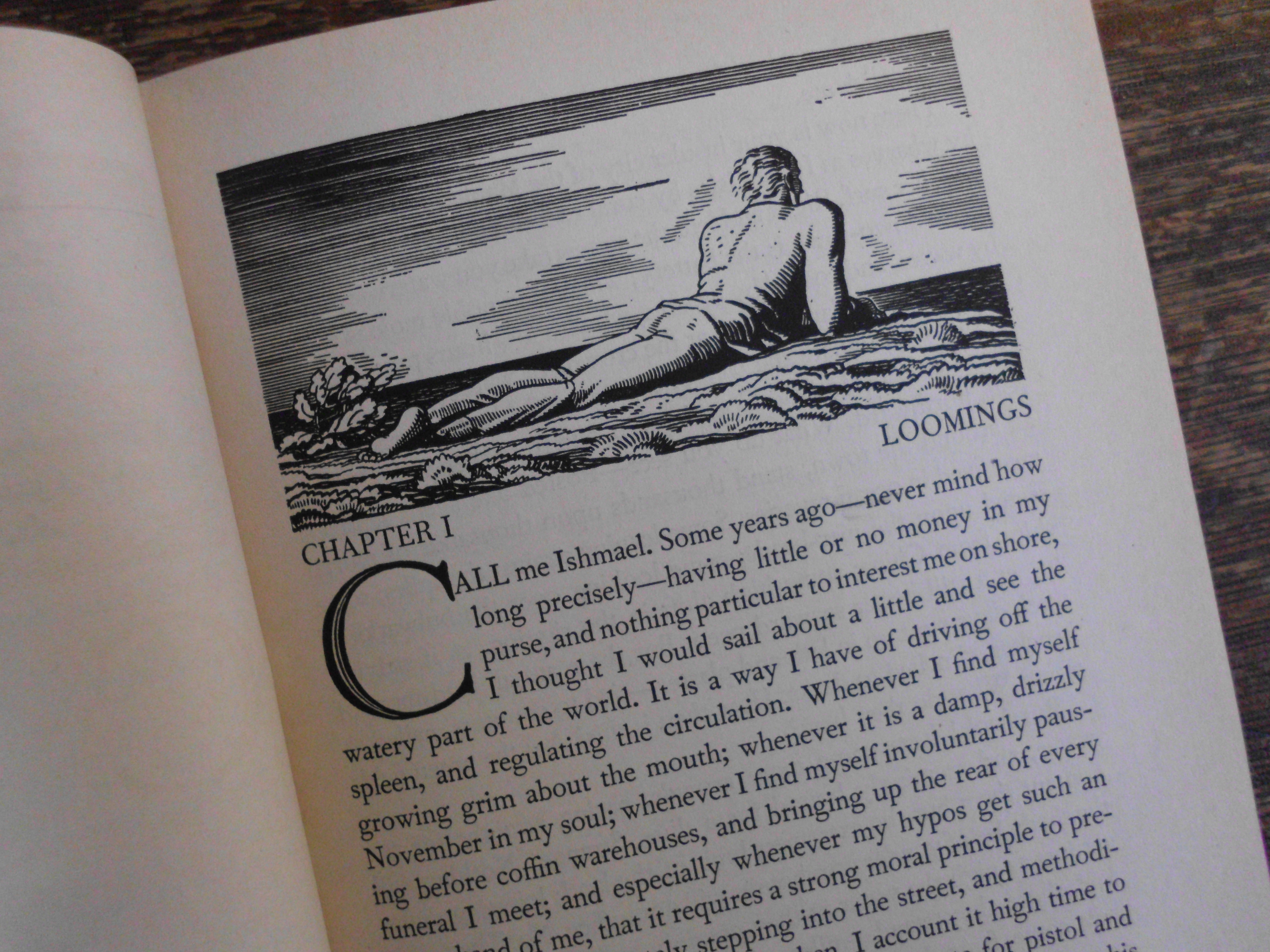
From the 1930 edition illustrated by Rockwell Kent.
Call me crazy, but Moby Dick is my favorite novel. My favorite book. My favorite source of inspiration as a writer and a human being. It’s my Single Desert Island Book–narrative, lyrical, philosophical, funny, heart-warming and heart-breaking, one of the Biggest Tales of All Time, but with all sorts of weird almost postmodern flourishes (whole chapters in the closest thing to screenplay format a mid 19th century writer could imagine, doppleganger characters and storylines, characters who appear and then suddenly disappear … or do they?, and so on).
 On November 14, 1851, the novel was published in England by Richard Bentley. Bentley was probably counting on the success of Melville’s earlier bestsellers (yep, Melville was actually a Young Celebrity Author in his time) Typee and Omoo, based loosely on his real-life adventures surviving a mutiny and jumping ship off a merchant marine vessel and living among “cannibals” for a while (the guy woulda been all over cable news channels), to generate substantial sales. Needless to say, the industry was fickle even back then. Am I saying that the author of one of the world’s best-known English language novels deserves more recognition than he already has? YES! Am I saying that pretty much all of Western literature and entertainment from Gravity’s Rainbow to “Survivor” can be traced back to this one book? YES!! I’m not saying I’d be right about these things; just enthusiastic enough that I hope it is infectious; just infectious enough that I hope you squint at that first page and read the poetry in that first paragraph, and let the great shoulders of that prose hold you up and point you to the vast waterways within your own story.