Tag Archives: haiku drink coaster

Designing a (haiku) drink coaster, pt 1

This jigsaw of metal type, wood and quoins (those locks that hold it tight)...

This jigsaw of metal type, wood and quoins (those locks that hold it tight)…

I met with Emily Hancock of St Brigid Press today to go over some designs and proofs of the “Night Walk on Cape Cod” haiku sequence. When you set metal type by hand, you cannot be cavalier with your design decisions! After years of using InDesign to design books, it was wild getting back into a workspace where each letter and every bit of “empty” space is actually a physical object to place so that the reader best navigates the printed page. (No Ctrl-Z here, sez he!)

...placed on this hundred-year-old press and adjusted and tweaked  by Our Dedicated Printer...

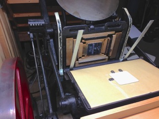
…placed on this hundred-year-old press and adjusted and tweaked by Our Dedicated Printer…

The full set will be 8 coasters, each with a different haiku from the sequence. The front/top will have the haiku with a wave-like ornament, printed in a wonderful dark green. Emily hand-mixed this color using at least two different greens and black.

The back will have the sequence title, the place of the poem within the sequence, and the printer’s mark.

Emily has set type for five of the eight haiku, and printing will begin this weekend.

In letterpress printing, nothing is as simple as it seems. Even in printing the coaster’s back, Emily will have to stop printing eight different times, pull the type off the press, and adjust the sequence number on the back (see below for proof of what the back of the first coaster will look like).

...turns into this proof of the coaster's back. In the background is an actual coaster, undoubtedly anticipating its eventual transformation.

…turns into this proof of the coaster’s back. In the background is an actual coaster, undoubtedly anticipating its eventual transformation.

The typeface for the poems is Garamond Italic, and in the next post I’ll show a few proof samples of the haiku design.

Photo of the press courtesy of St Brigid Press

Haiku + Drink + Fine Letterpress Publisher = Coaster Sequence??

NightWalkonCapeCod_prep1

At St Brigid Press, the table is set for design–and the type is set, as well, if you can read backwards.

I’m happy to announce that I’m working with Emily Hancock of St. Brigid Press to publish a haiku sequence entitled “Night Walk on Cape Cod” … in a very unique letterpress format.

Emily, whose work is featured in an article in Blue Ridge Life magazine, has done some great typographical work in books, posters, even a cool American Authors drink coaster series.

coastersdetailstbrigid

Samples of the “American Novelists Series” of letterpress drink coasters from St. Brigid Press.

Over the past few days Emily has begun designing a series of coasters which will comprise the eight-part haiku sequence “Night Walk on Cape Cod” from my book Vanishing Tracks. The set will be available soon here on the Translations site as well as at St Brigid Press.

Haiku on drink coasters? Would it be wrong of me to say that the combination strikes me as, well, intoxicating? (Okay, so it would be wrong. I just can’t seem to hit the backspace key, though.) Imagine lifting your favorite drink off the counter of your equally favorite drinking hole–even if that is your kitchen or den–and seeing the engimatic three line stanza that immediately identifies itself to you as a haiku, looking up at you invitingly as you take your first drink. Go ahead, read it. It doesn’t have to make sense. A few sips later, maybe some interpretive inspiration hits you, hmm, and next thing you know you are all zen with the world and entertaining your guests (or pets) with your newly found elucidation of things deep and mysterious. And like any literary treat, these coasters are reusable, and only get better with age, much like their content.

Should I go on? Great for book club meetings, most of which tend to involve some form of refreshing beverage! When you consider that the labors of writing and reading literature often drive a person to drink, it’s nice to be able to turn the tables on that equation and say that the enjoyment of drinking could potentially turn one to reading poetry…and appreciating fine printing.

I’ll have order information and some samples up on the site soon.

The print run will be limited so feel free to contact me if you would like to reserve a set. Opa!


Photos courtesy of St Brigid Press