


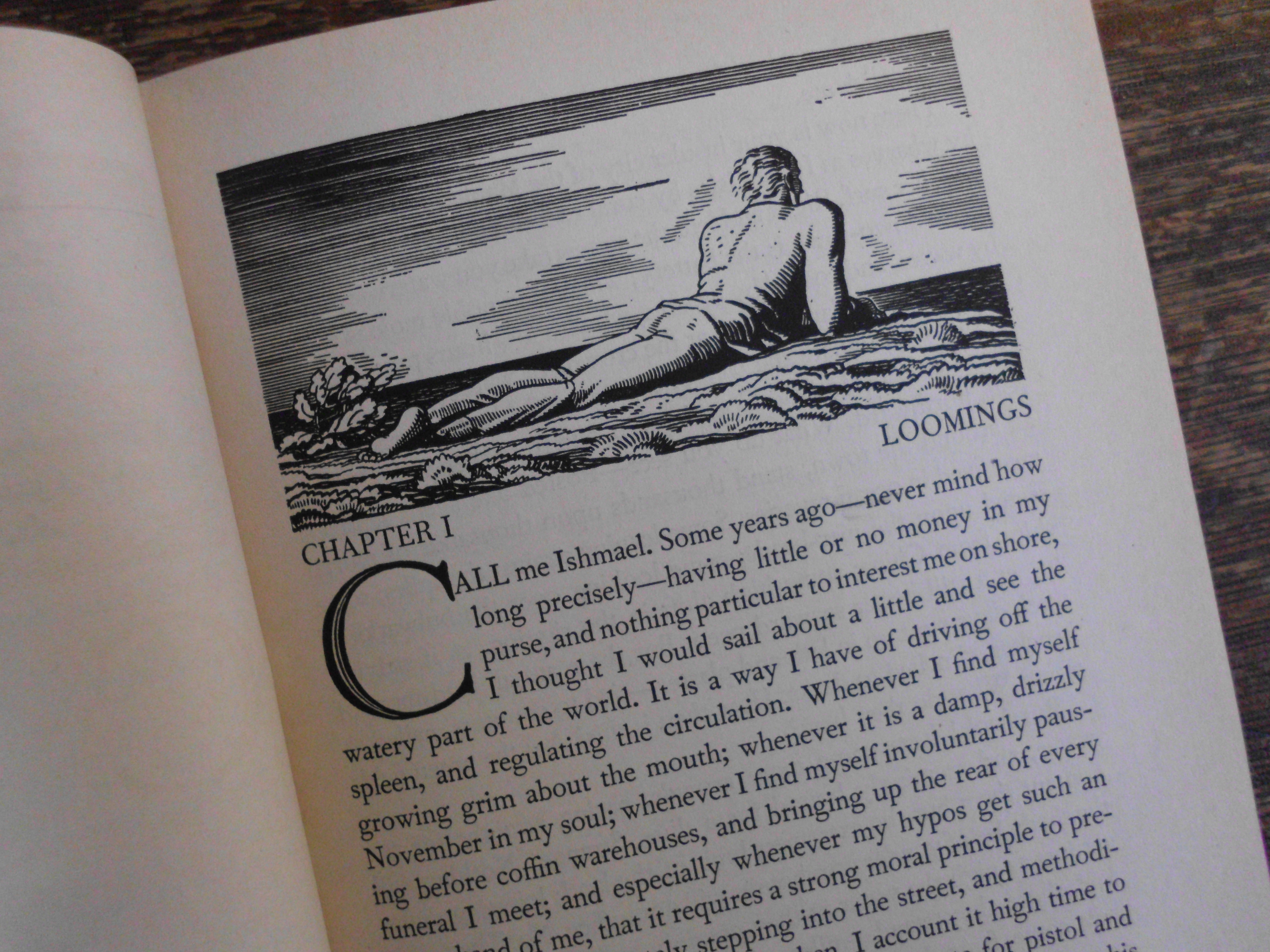
From the 1930 edition illustrated by Rockwell Kent.
Call me crazy, but Moby Dick is my favorite novel. My favorite book. My favorite source of inspiration as a writer and a human being. It’s my Single Desert Island Book–narrative, lyrical, philosophical, funny, heart-warming and heart-breaking, one of the Biggest Tales of All Time, but with all sorts of weird almost postmodern flourishes (whole chapters in the closest thing to screenplay format a mid 19th century writer could imagine, doppleganger characters and storylines, characters who appear and then suddenly disappear … or do they?, and so on).
 On November 14, 1851, the novel was published in England by Richard Bentley. Bentley was probably counting on the success of Melville’s earlier bestsellers (yep, Melville was actually a Young Celebrity Author in his time) Typee and Omoo, based loosely on his real-life adventures surviving a mutiny and jumping ship off a merchant marine vessel and living among “cannibals” for a while (the guy woulda been all over cable news channels), to generate substantial sales. Needless to say, the industry was fickle even back then. Am I saying that the author of one of the world’s best-known English language novels deserves more recognition than he already has? YES! Am I saying that pretty much all of Western literature and entertainment from Gravity’s Rainbow to “Survivor” can be traced back to this one book? YES!! I’m not saying I’d be right about these things; just enthusiastic enough that I hope it is infectious; just infectious enough that I hope you squint at that first page and read the poetry in that first paragraph, and let the great shoulders of that prose hold you up and point you to the vast waterways within your own story.
Just put a fresh poem on the Brand New Stuff page, as we await the first light snowfall here in the shadow of the Blue Ridge mountains.
If you have never seen a letterpress in action, check out this video, which Emily over at St Brigid Press made while working on the haiku sequence:

Close up of the back of the coaster. The title is in Copperplate Gothic.

Back on the rack! Some of the output of a day’s fruitful collaboration between a Chandler and Price 10×15 NS press (born in Cleveland, in 1914) and designer and printer extraordinaire Emily Hancock of St Brigid Press (born in North Carolina, much more recently).
Tomorrow, more of the same. Monday: The haiku go on the press. The entire haiku sequence can be found in the book Vanishing Tracks, available here as a free PDF or hardcover book.
I’ll have a link up in the next day or so to pre-order this limited edition series of “Night Walk on Cape Cod” printed in letterpress on durable drink coasters.
All photos courtesy of St Brigid Press
Every day he stands
Always about to be picked
When the recess ends
***
from the book Sisyphus at the Playground
Eight haiku. Twenty four total lines. A unique drink coaster printing project. What’s the big deal?
Hundred-year old presses. Tiny pieces of metal type. Questions like, errr, do we have a ligatured ff instead of a regular ff? Did a piece of roman type slip into the italic type drawer? Did we just really run out of lowercase e’s?? And so on.

First poem in the haiku sequence. The ink is a rich dark green.
Here’s Emily’s design for the haiku side of the coaster, with a proof on regular paper placed on top of a coaster so you can see the approximate registration.
I like that the haiku has its own space, and that all the other information, including the title and sequence of the poems, is on the back. It gives the reader the experience of the poem alone.
And here’s a proof of the last poem in the sequence:
An old Marvel Comics-inspired No-Prize to anyone who spots the Boy I’m Glad We Proofed This detail. Oh, wait. I’m out of No-Prizes. So just read the copy to the left.
I was so enamored with seeing my own work printed in beautiful Garamond that it took me over a dozen views before I noticed the “s” in the first line is a roman “s” and not an italic “s”. Now there’s a whole philosophical movement going back a couple-three generations among some printers that states you should leave some flaws in your work, because after all to err is human, and in some cases perfectly so. But in this case I decided that I’d just stick with fixing it and not get all philosophical.
That will be the reader’s job, upon the second or third drink…
Photos courtesy of St Brigid Press
